![]()
Change is sometimes a good thing. You may have recently noticed the new shamrock-style logo slowly making its way to the public this month. SeaWorld Parks & Entertainment has chosen new logos for both Busch Gardens Williamsburg and Busch Gardens Tampa. The biggest change in the new logo is the ‘coaster tree’ that is both representative of a tree and of a roller coaster. The new logo is said to better reflect their mission to entertain guests and to focus on the natural world. The new logo along with a new tagline were sent out in an email to select media and employees.
I received a copy of the official media announcement describing the new logo as well as the reasoning behind it. Here’s a copy of the letter:
Busch Gardens former logo
Busch Gardens Current logo
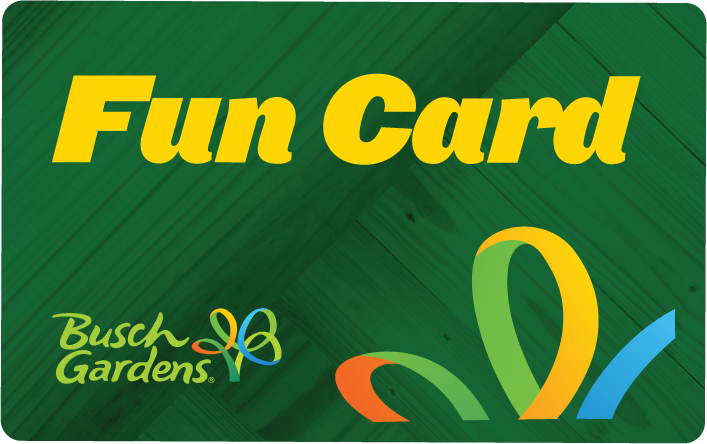
Busch Gardens also designed 2013 season passes and tickets. Below is the new look of a fun card.
Expect new signage including new entrance signs at both parks in the near future.
Do you like the new modern logo, “Coaster Tree”, and the new “Fun Grows Here” marketing campaign? Let us know below or via our socials!
For more information, including tickets, visit Busch Gardens’ official website.
keep it social!
Follow us on twitter @BehindThrills
Like us on facebook: facebook.com/BehindThrills